
QuickTeams
A resource management SaaS for IT service companies using the staff augmentation model.
Purpose
To walk you through the end-to-end design process of QuickTeams, highlighting how we identified key pain points, designed intuitive solutions, and aligned user needs with business goals.
My Role
Wireframing
Prototyping
User Research
Visual Design
Product Thinking
Tools
Figma
Team
QuickLabs.in
Product Overview
What is QuickTeams?
QuickTeams is a resource management platform (SaaS) built for small to mid-sized IT service companies using a staff augmentation model, helping them easily plan capacity, schedule resources, and monitor availability and billability across multiple client projects.
Why do we need QuickTeams?
Most small and mid-sized IT service companies outgrow spreadsheets, but enterprise ERPs are too complex and expensive.
QuickTeams bridges this gap —making resource management simple, efficient, and perfectly suited for growing small to mid-sized IT service providers.


Problem Statement
Managers
Managers in small to mid-sized IT service companies often lack a scalable, unified way to plan, allocate, and track resources across projects—resulting in miscommunication, inconsistent utilization, project delays, and lost revenue.
Employees
Employees lack visibility into their assignments and capacity, leading to surprise overbooking, unclear expectations, and misalignment with managers—causing frustration, burnout, and disengagement.
Goals and Objective
Managers
Complete Oversight: Instantly see who’s working on what, for how long, and at what capacity across all projects.
Optimized Resource Allocation: Minimize bench time and under- or over-utilization to boost billable hours, efficiency, and revenue.
Smarter Planning: Prevent project delays and employee burnout with data-driven scheduling and workload management.
Performance Tracking: Monitor individual KPIs to evaluate employee impact and progress toward business objectives.
Employees
Assignment Clarity: Easily see which projects they’re assigned to, for how long, and at what capacity.
Workload Awareness: Track their own availability and workload to avoid overwork and manage expectations.
Better Communication: Reduce ambiguity with managers about priorities, bandwidth, and project needs.
Performance Insights: Access personal KPIs to identify strengths and areas for growth.
Overall Objective
To deliver an intuitive, scalable resource management tool for small to mid-sized IT service companies—helping managers gain visibility and control, empowering employees with clarity and communication, and driving higher utilization, reduced bench time, and revenue growth.
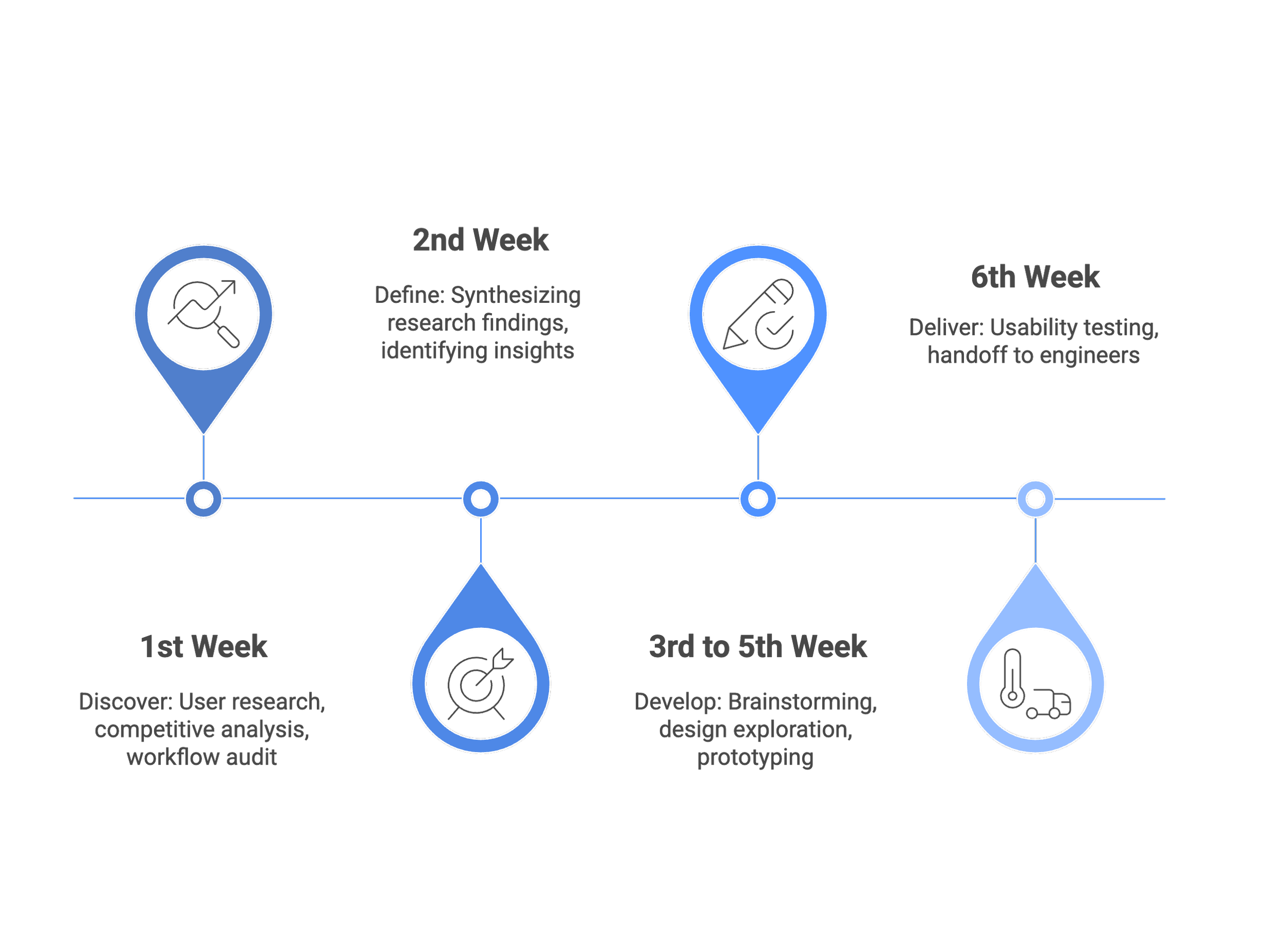
Design Timeline
This visual illustrates a 6-week product design process, moving from discovery and research to defining insights, then developing concepts and prototypes, and finally ending with usability testing and engineering handoff.
User Research
Qualitative Interviews
We interviewed professionals aged 34–45 at Crownstack. Our goal was to understand their current workflows, uncover key pain points, and understand their expectations of a tool like QuickTeams.

“As we scale, relying on spreadsheets to manage resources is no longer sustainable. Without a more structured system, we risk loss of revenue, client trust, and poor resource utilization, all of which directly impact business performance.”
- Aashish Dhawan, CTO

“I often have to rely on updates from multiple people or dig through spreadsheets just to figure out who’s free and who’s already booked. As the company’s grown, it’s become harder and harder to get a clear, complete picture.”
- Deepika Gupta, Delivery Head

“I’ve had weeks where I was working on three projects at once and didn’t realize I was at 140% allocation. ”
- Varun Kumar, Developer
Main Themes


Key Insights


Features


Market Analysis
We compared QuickTeams with commonly used resource management tools — Google Sheets and Enterprise ERPs.
While Sheets lack scalability and ERPs are too complex for small- mid sized teams, QuickTeams is purpose-built for staff augmentation, offering the simplicity of spreadsheets with scalable management, built-in KPIs, and intuitive dashboards tailored for IT service companies.

Persona Development
I created this persona as a synthesized representation of our target users — capturing their key needs, goals, frustrations, behaviors, and thought patterns based on insights gathered during qualitative interviews.

Prototyping
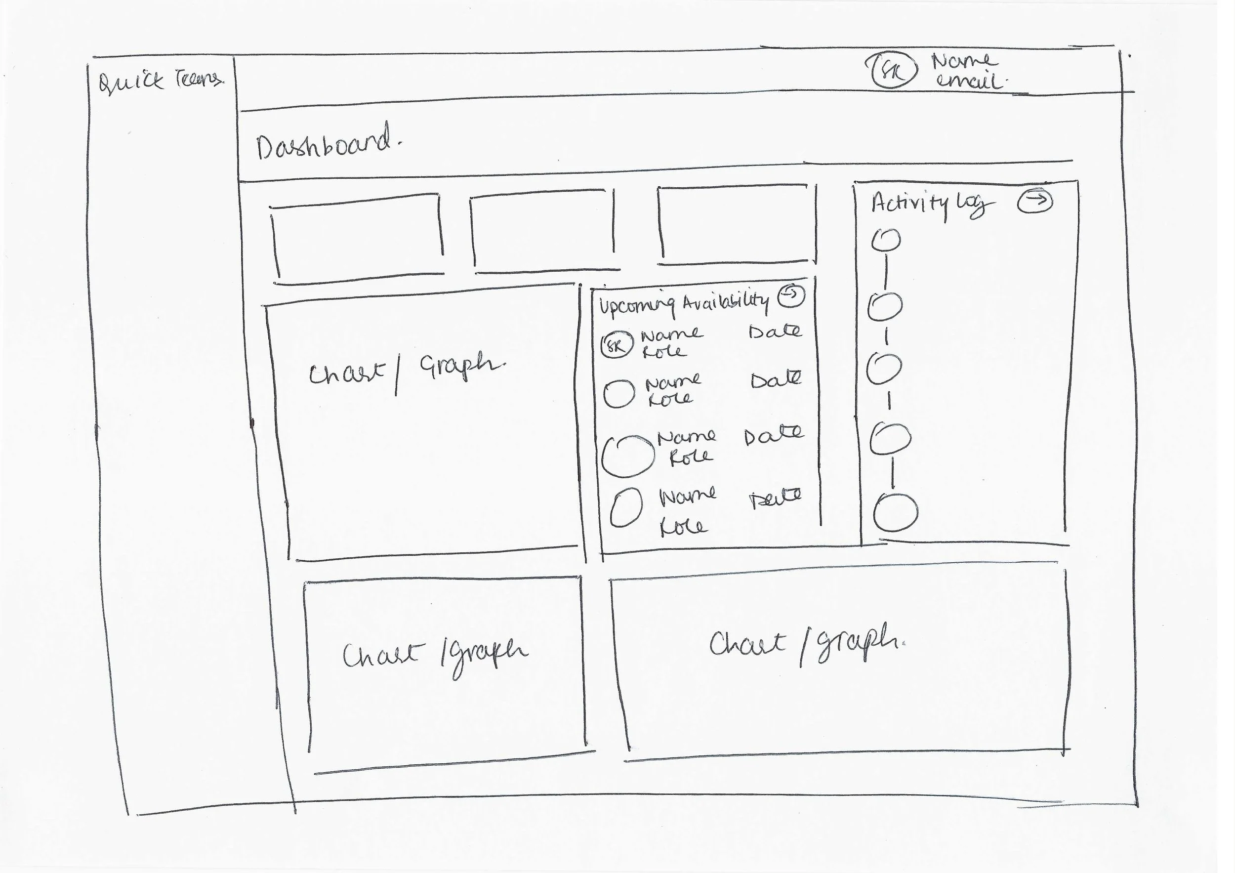
Paper Sketches
I drew some early sketches of the screens based on our user research and market analysis. The goal was to create a simple, user-friendly interface that incorporates the essential features.
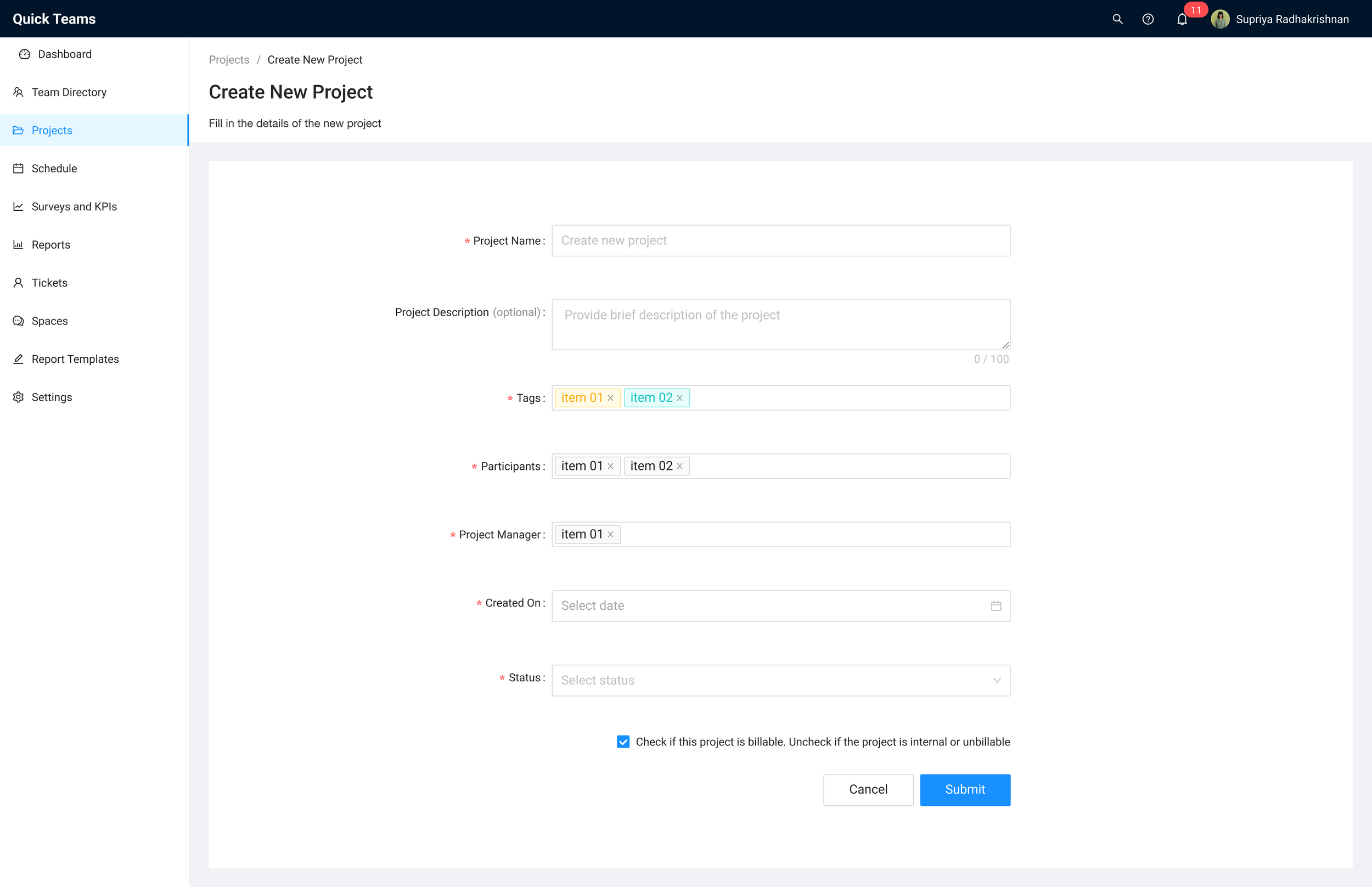
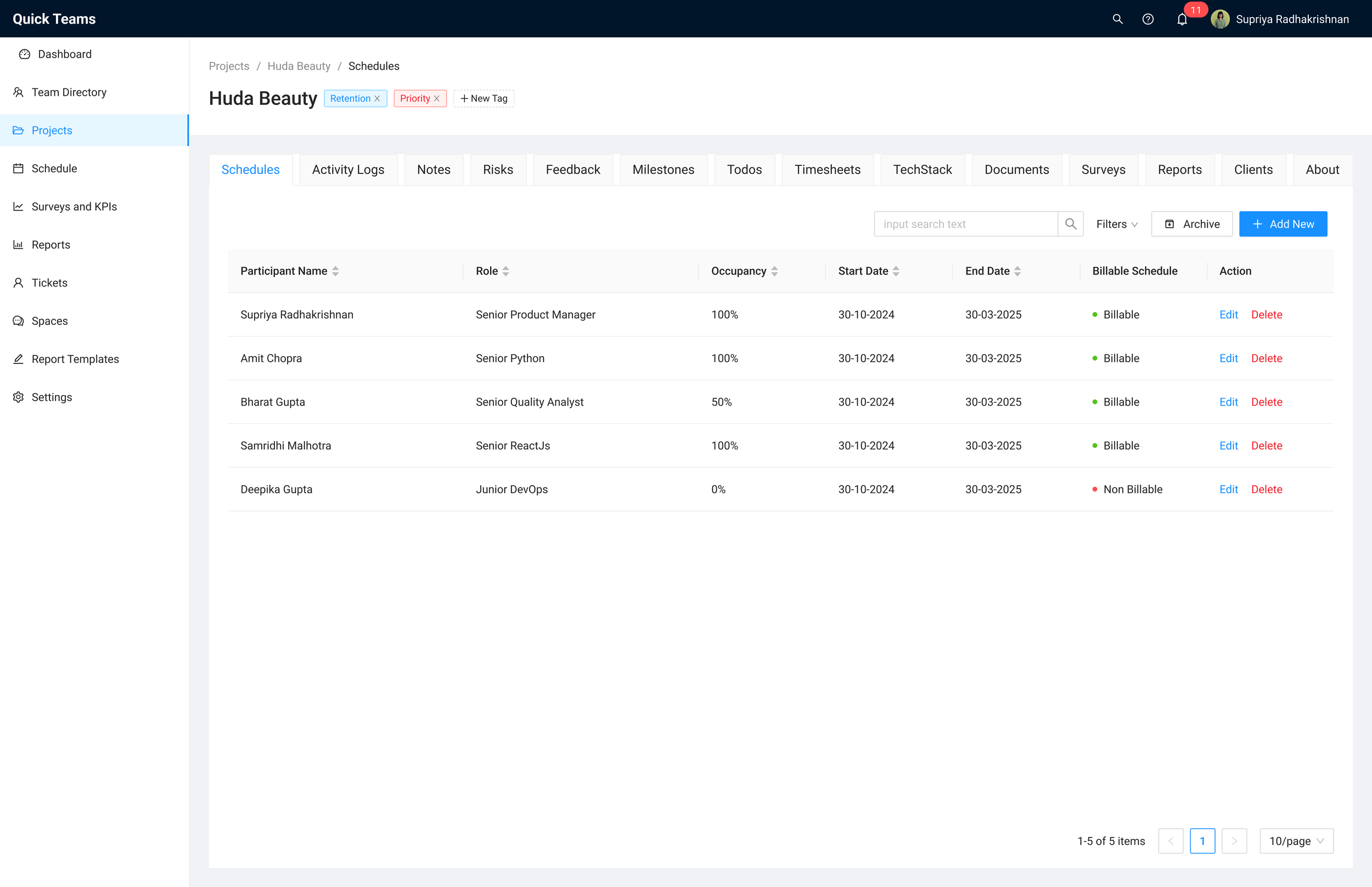
Key Screens
SCREEN 1 OF 6

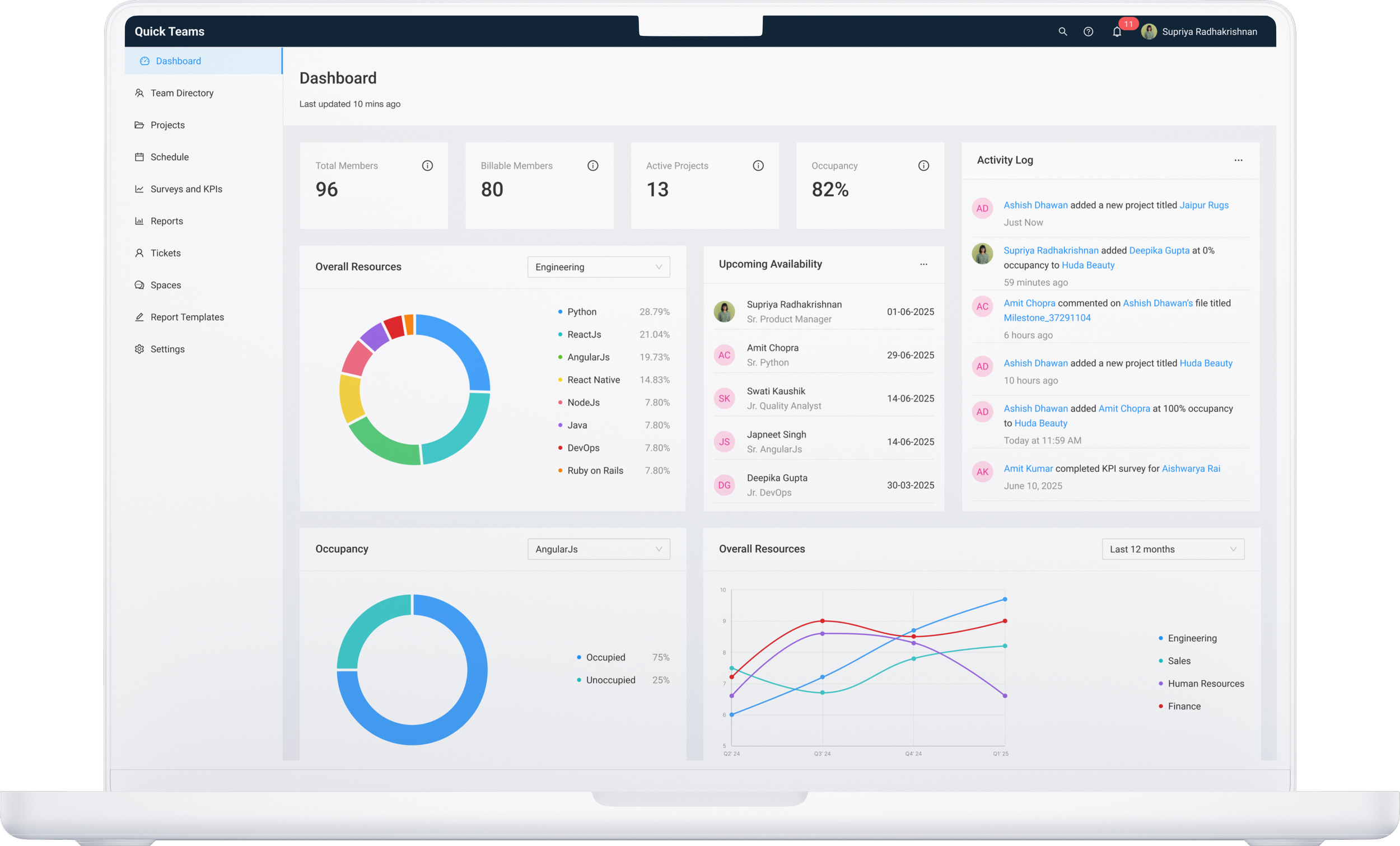
Dashboard
This screen gives an overview of available resources by discipline, resource occupancy by job role, and overall activity log. It also highlights upcoming availability and key performance trends, enabling smarter scheduling and capacity decisions.
SCREEN 2 OF 6
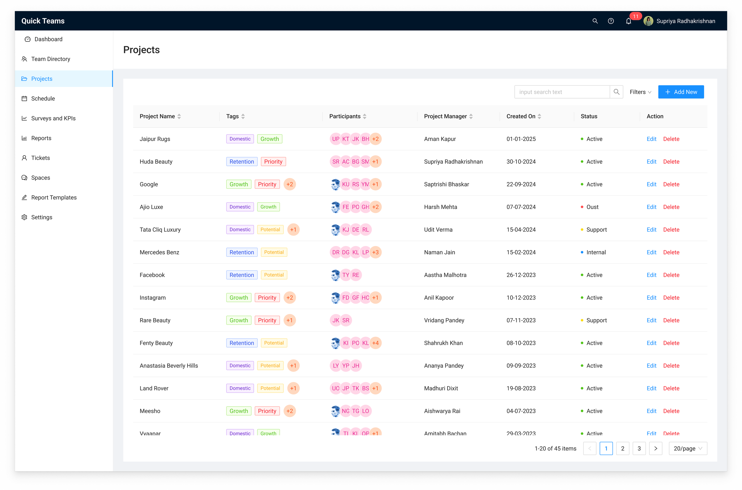
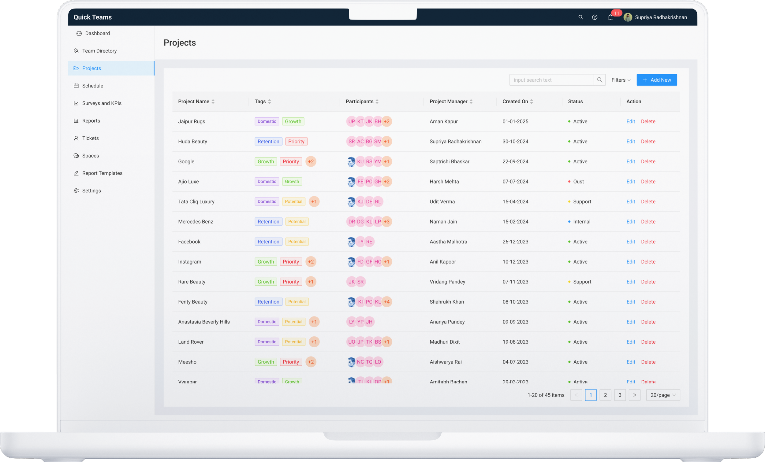
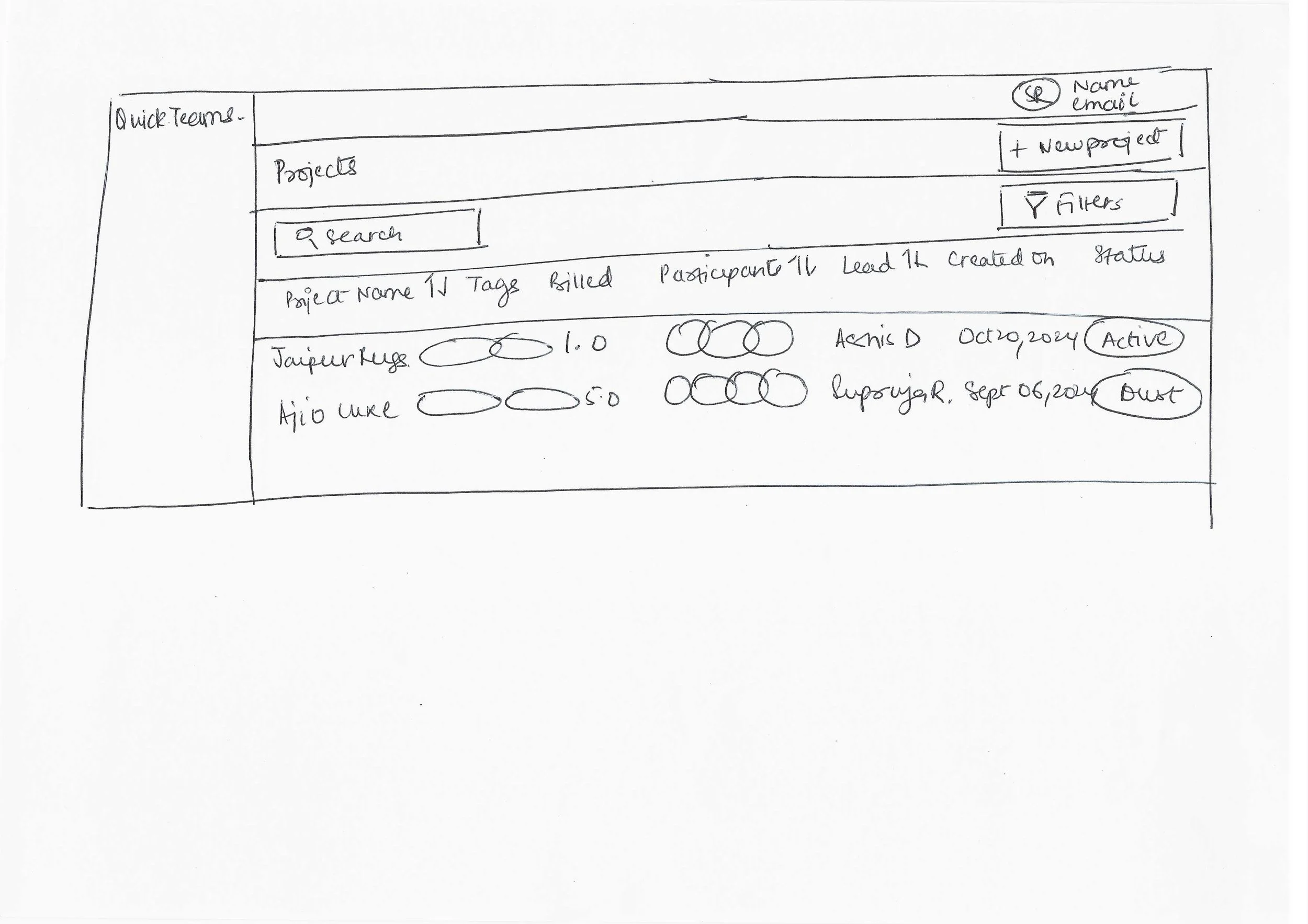
Project Overview
This screen offers a centralized view of all ongoing projects, displaying their statuses alongside essential details like the assigned team members and project leader, helping managers monitor progress and coordinate resources efficiently.
SCREEN 3 OF 6
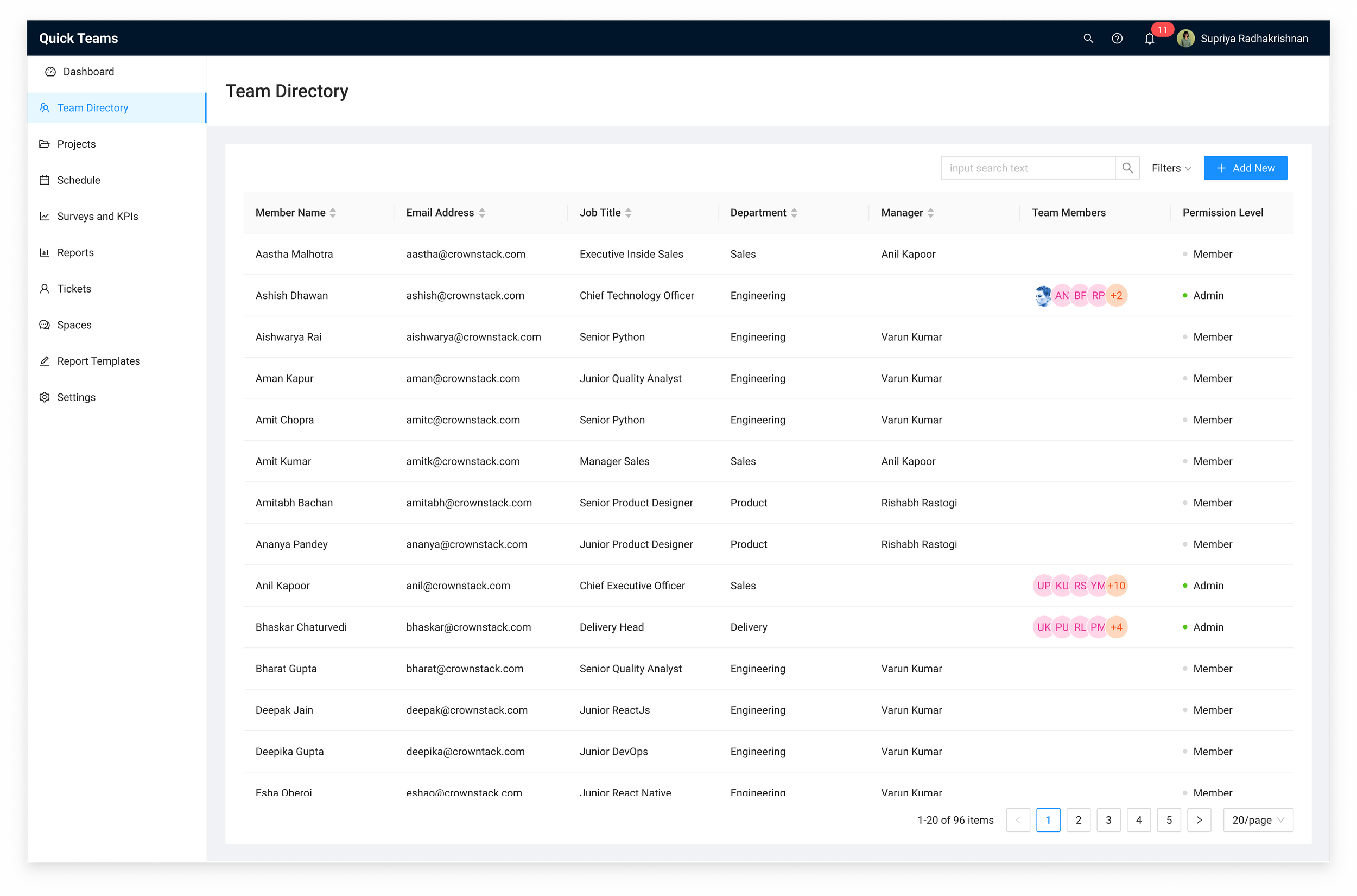
Team Directory
This screen provides a comprehensive directory of all team members, including their contact information, job titles, departments, reporting managers, team members, and permission levels. It enables efficient team management and quick access to relevant details for collaboration and coordination.
SCREEN 4 OF 6
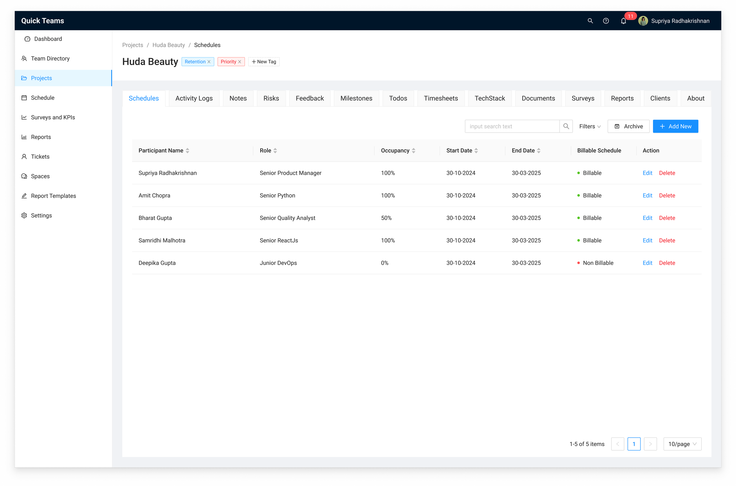
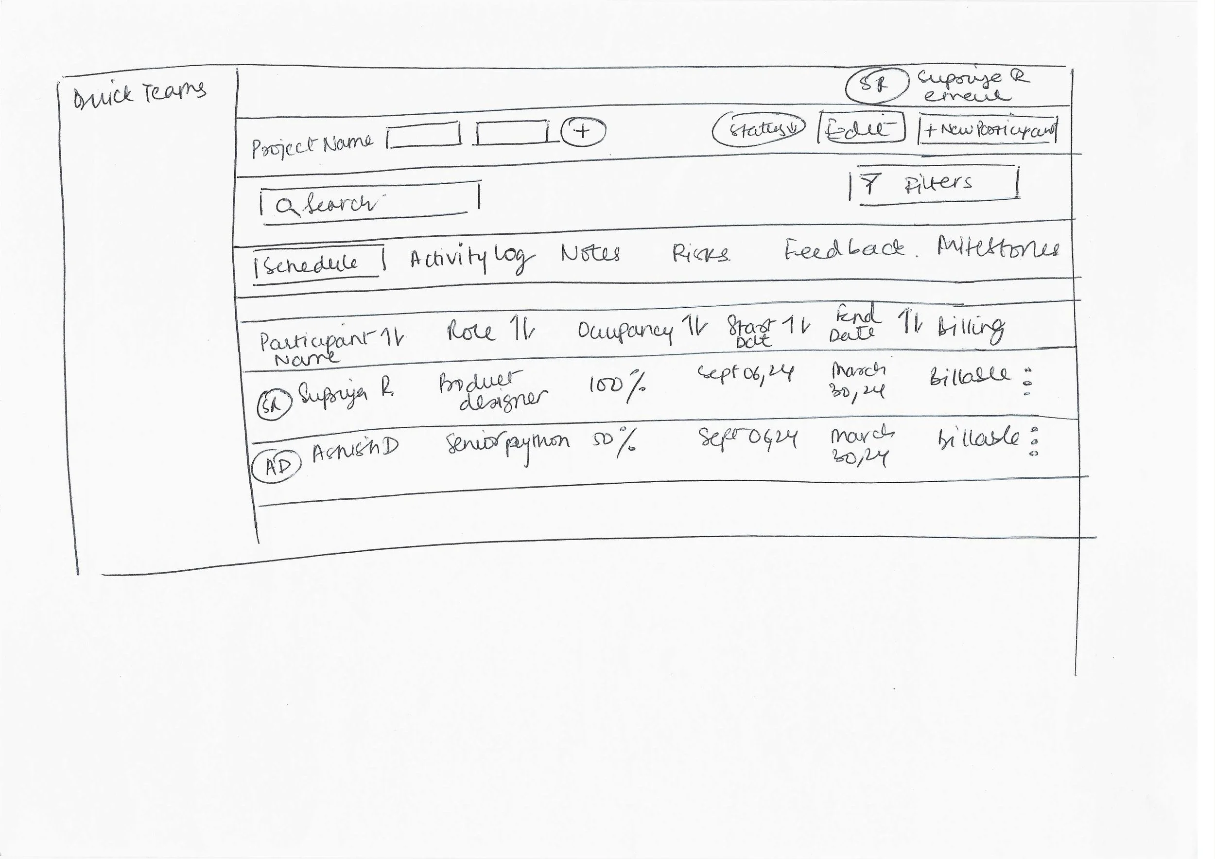
Project Schedule
This screen provides an overview of team members, showing names, roles, status, occupancy, timelines, and billing. It helps managers efficiently track resource allocation and billing for retainer-based projects and ensures smooth project coordination.
SCREEN 5 OF 6
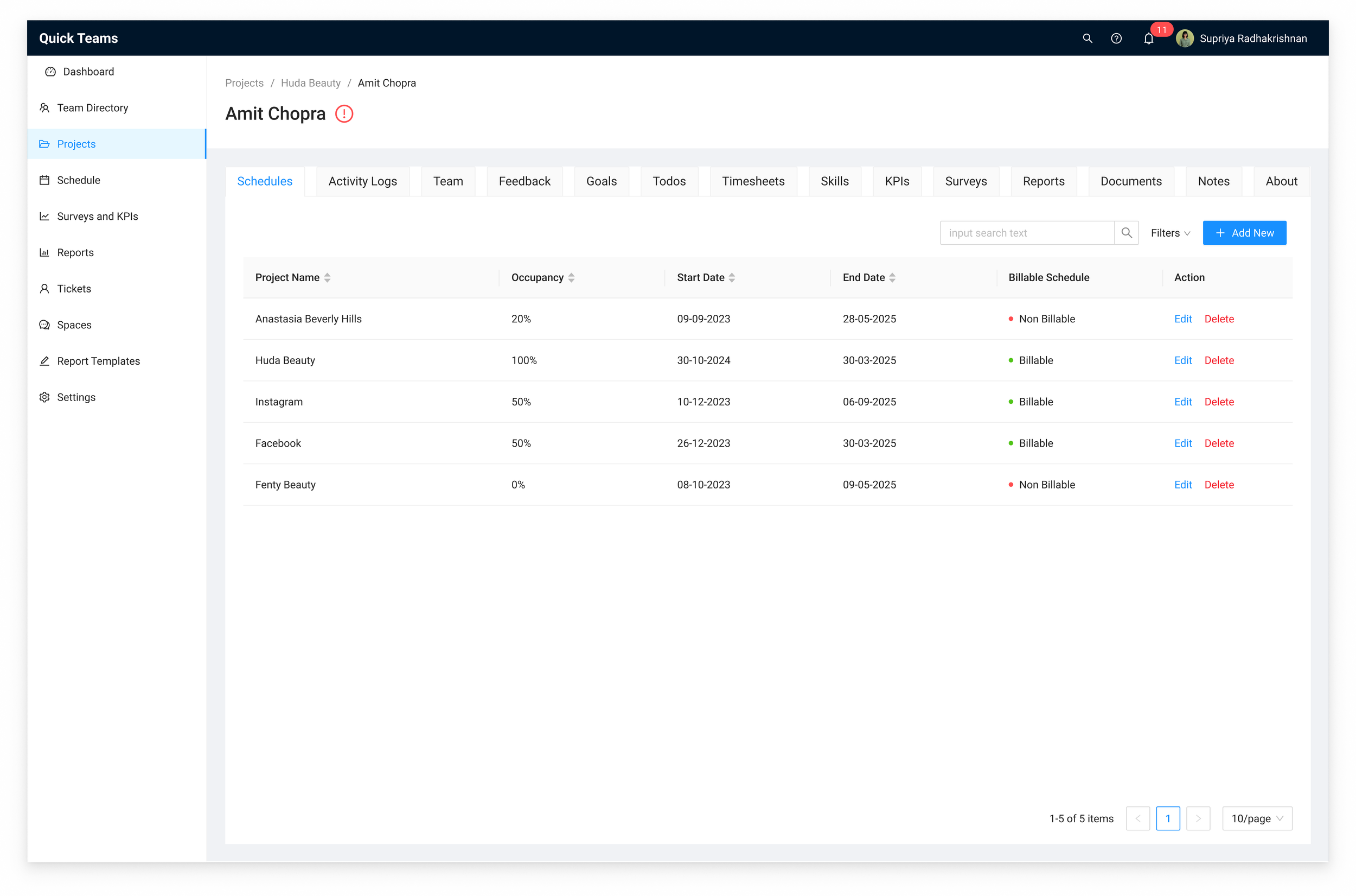
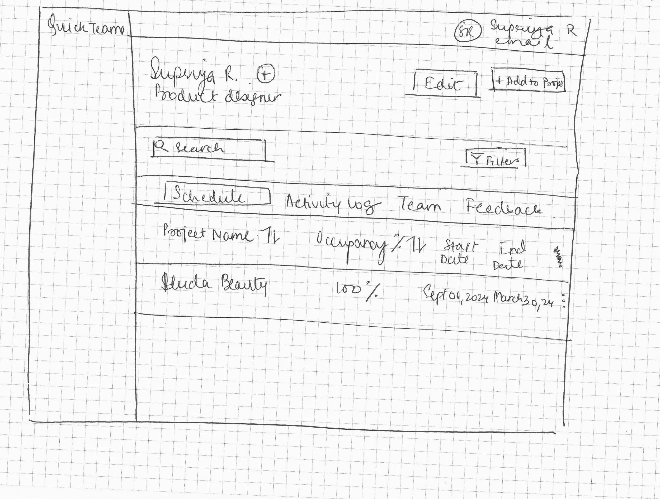
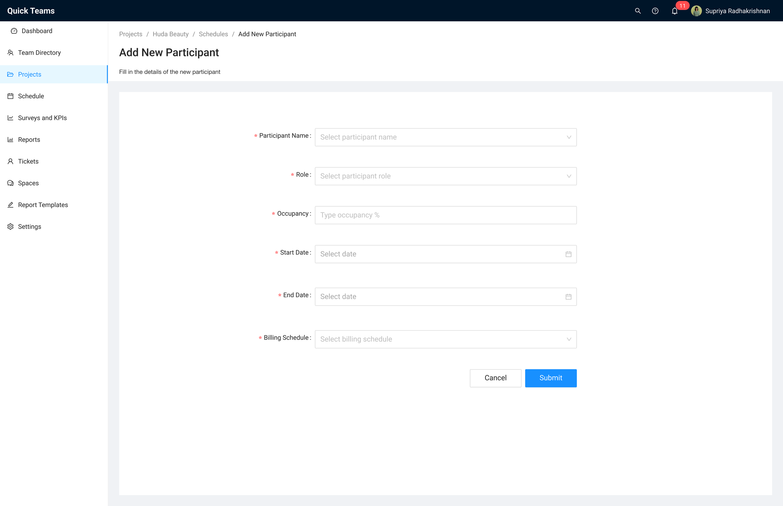
Participant Schedule
This screen gives employees a clear overview of all their current project assignments, including each project's capacity allocation, timeline, and billing status. It enables users to easily track their involvement across projects and manage their schedules more effectively.
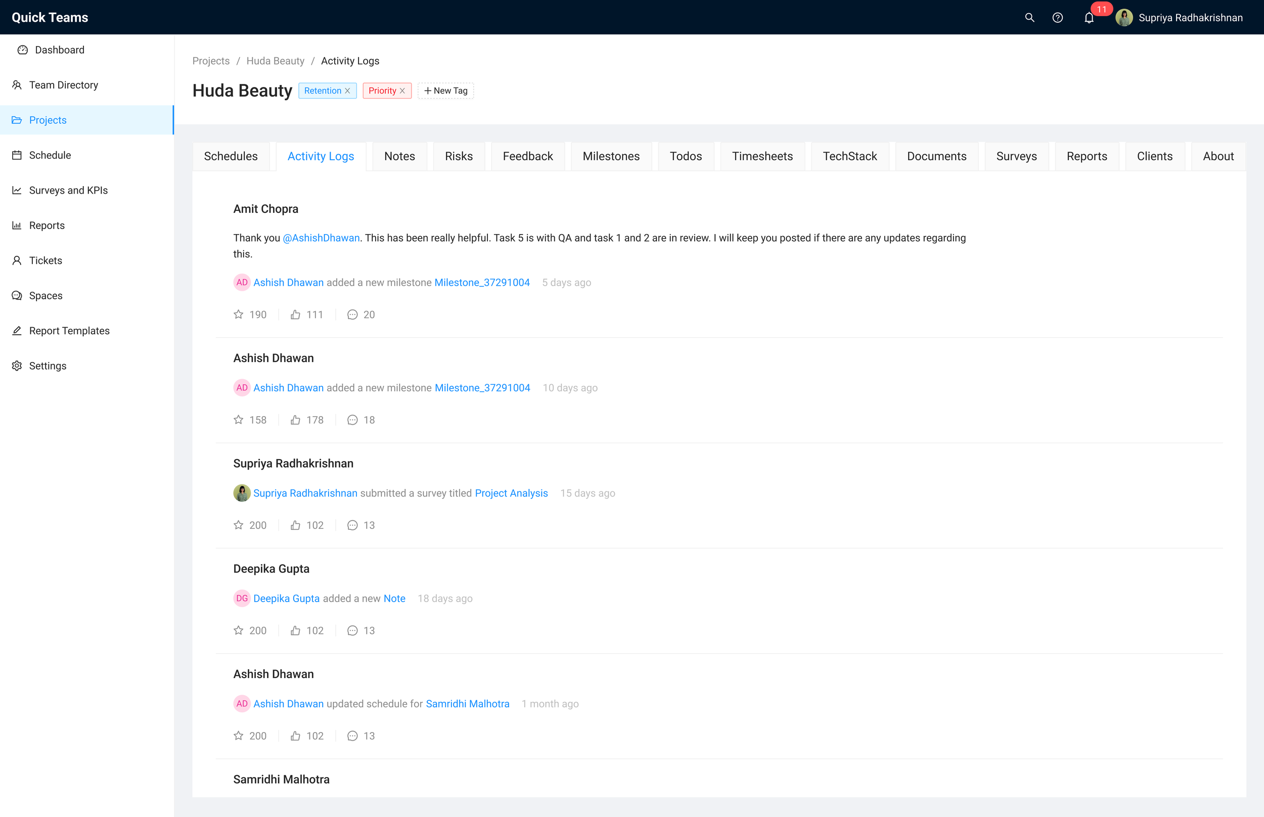
SCREEN 6 OF 6
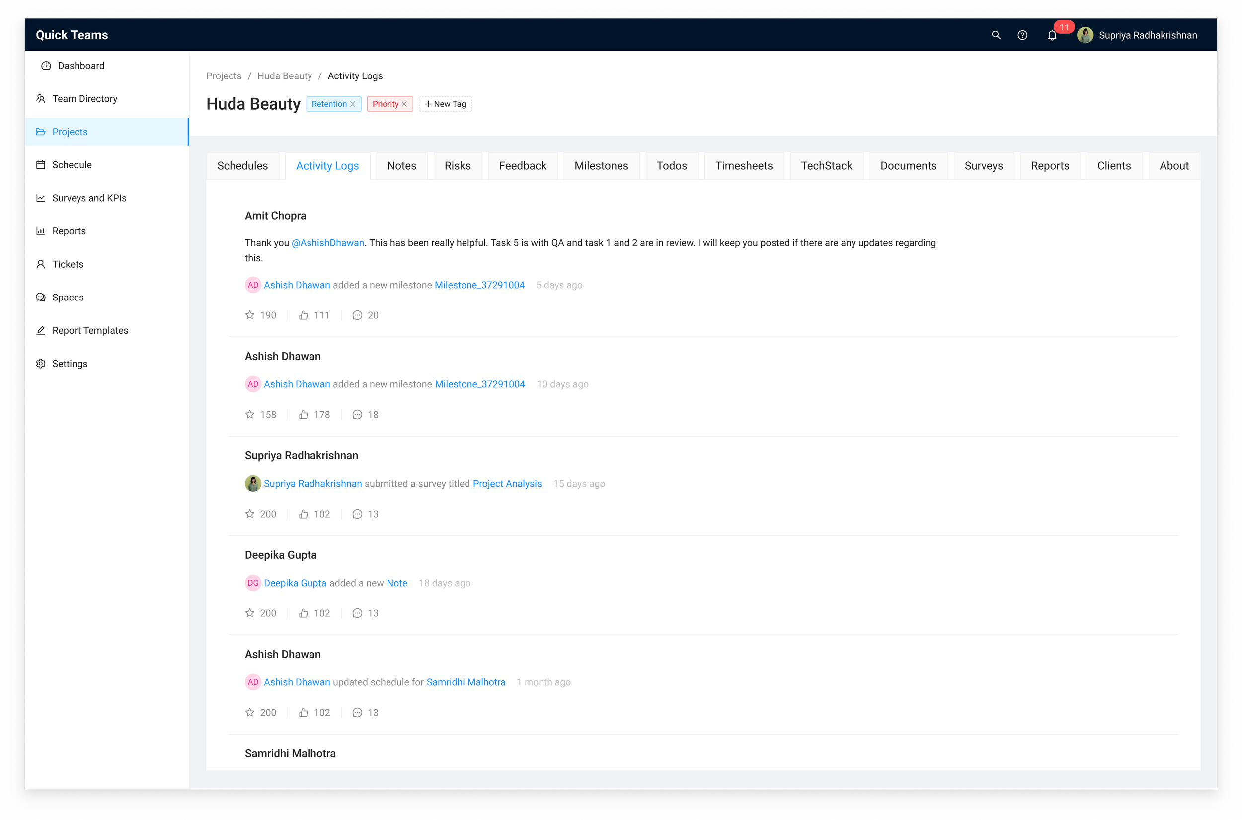
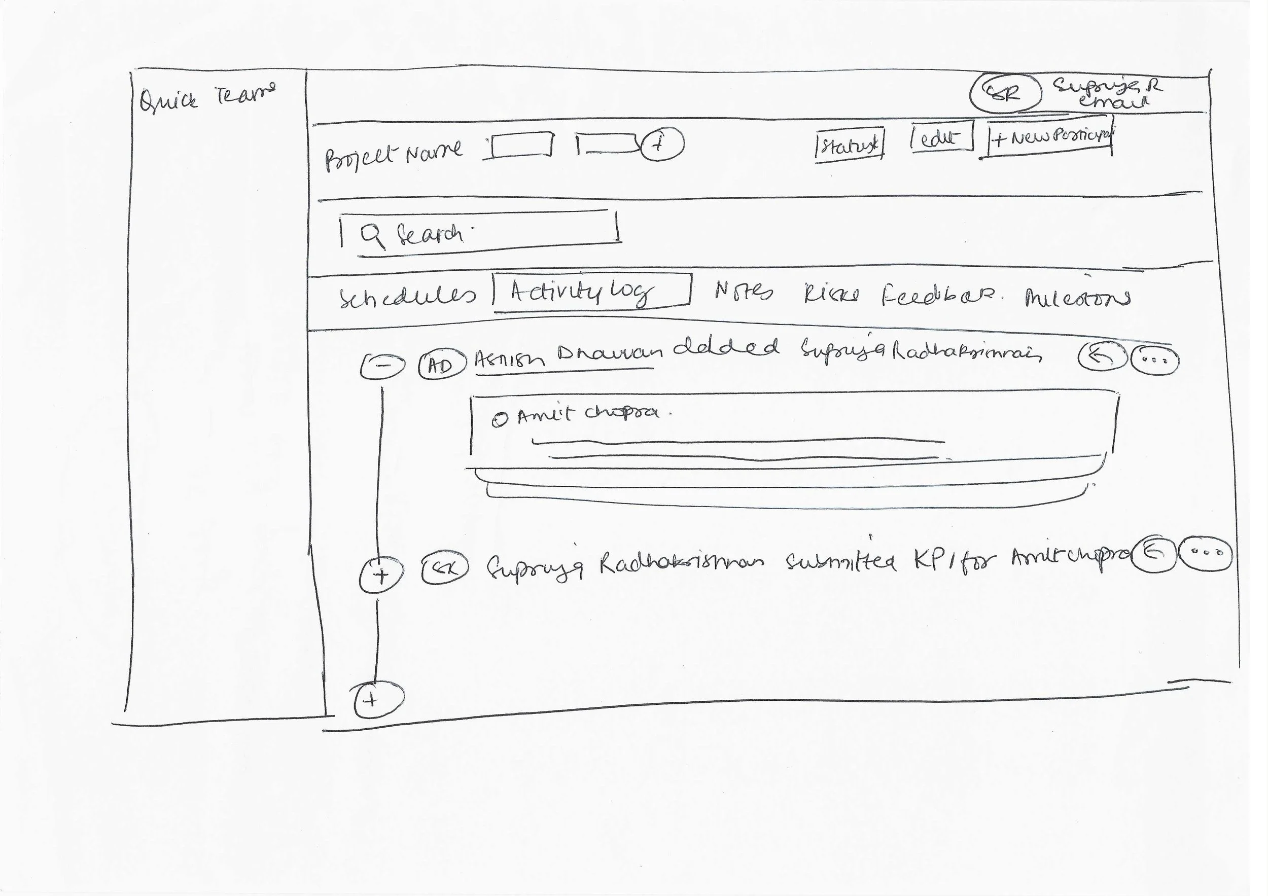
Activity Log
This screen provides a chronological record of all project-related actions and updates, allowing team members to track milestones, feedback, schedules, and other key activities related to that project in one place. It helps teams stay aligned, monitor progress, and maintain transparency throughout the project lifecycle.
High Fidelity Mockups
I turned the low-fidelity mockups into high-fidelity designs with a clean, easy-to-use interface. I focused on keeping things consistent and making sure the workflows were simple and intuitive.


Usability Testing
Leadership


Project Managers
Overview
Goal: This session aimed to identify usability barriers in completing the core tasks (e.g., adding a member, creating a project, adding participant to a project)
Participants: CTO, delivery head, 3 project managers
Format: Live and moderated
Observation: I took note of ease/difficulty, points of confusion.
Feedback Collection: After each task, I followed up with simple questions: “What challenges did you encounter? What would make this screen more intuitive for you?”
Scoring System:
3 points: independently completing a task
2 points: needed some guidance
1 point: attempted but did not complete the task
0 points: task was skipped
Scoring Interpretations:
Above 80%: Interface is user-friendly
60–80%: Minor refinements needed
Below 60%: Significant issues, requires redesign
Key Findings
High Task Completion Rates
Most participants were able to independently complete core tasks such as adding new members, creating projects, and editing participant details.
Usability scores for these tasks averaged above 80%, indicating a generally intuitive and user-friendly interface.
Areas for Improvement
60% of users were unclear on how to add tags, suggesting that the tag-adding process needs to be more intuitive and visible.
40% of users struggled to find the project archive function, indicating a need to make this feature more accessible and prominent within the interface.
Next Steps
Improve Project Archive Function Discoverability
Relocate or visually highlight the archive project feature in the interface to make it immediately apparent to users.
Make Tag Addition More Intuitive
Redesign the process for adding tags so it is more visible and easier to find and more intuitive.
Qualitative Impact
“QuickTeams has made it easier to win larger projects — clients trust us more because we can show transparent, accurate resource planning.”
- Gaurav S, Delivery Head of Northcorp Software
“Before QuickTeams, our company relied on messy spreadsheets — now resource allocation is simple, and I can see exactly who’s available at a glance.”
- Ravindra Soni, Co-Founder of Nickelfox
“Our team feels less stressed because allocations are clear and expectations are set upfront.”
- Dhruv Goel, Founder of Grappus
“It gives us clarity and confidence in planning. We can finally balance workloads without overbooking or underutilizing our team.”
- Deepika Gupta, Delivery Head of Crownstack
“QuickTeams doesn’t just help us internally; it also builds client trust since we can show we have the right people available at the right time.”
- Nilesh Ukey, Founder of Nickelfox
“It’s easier to communicate with clients now — I can share real-time resource availability with confidence.”
- Tejveer Singh, Founder of Vayuz Technologies
Reflection
Outgrowing Spreadsheets
This project helped me deeply understand how tools like Spreadsheets start breaking down as companies scale. Resource allocation becomes increasingly complex, and even small inefficiencies can lead to project delays, misalignment, or revenue loss.
From chaos to clarity
A major insight was how much mental load users were carrying due to fragmented tracking. Bringing real-time occupancy and availability into a centralized dashboard was not just a UX improvement; it directly reduced anxiety and decision paralysis.
Cross-functional clarity
Aligning early with the CTO, delivery leads, and PMs made a huge difference. It allowed me to balance user needs with internal constraints and maintain momentum even when not all features could be implemented right away.
Next Steps
Modular & Role-Based Dashboard Templates
Introduce predefined dashboard layouts based on common roles (e.g., Delivery Head, PM, Developer), with the flexibility for users to rearrange or customize widgets, offering structure for new users and control for power users.
Integrations with HR & CRM Tools
Connect with tools like Keka (HR) and HubSpot (CRM) to sync data and help companies manage resources more efficiently across platforms.
Scale Access Control Options
While QuickTeams already supports permission-based views, we’ll need to evolve this further as team sizes grow, allowing for more granular access levels, role hierarchies, and department-based visibility to ensure information is secure and relevant.