

Apple Calculator
A user-driven redesign of Apple’s built-in mobile calculator, inspired by user reviews and insights from leading competitor apps.
Redesign Apple’s native calculator app with a more intuitive, accessible, and feature-rich experience by adding history, memory functions, and real-time calculation visibility while maintaining Apple’s clean, familiar design.
Objective
My Role
Wireframing
Tools
Figma
Visual Design
Prototyping
User Research
Mockup
Team
Duration
2 weeks
Solo project
In Apple’s most recent software update, the Calculator app was revamped to include several features like a backspace button, a history button, and visible ongoing calculations—features I had prioritized in my redesign based on user feedback. When I worked on this project, these enhancements were not yet implemented, making my redesign a forward-thinking approach to addressing user needs and improving functionality.
Important Note
The Challenge
This raised a key design question: Why does such a widely used tool feel so limited? That curiosity led me to reimagine the calculator as a more functional, accessible, and user-centered experience, while staying true to Apple’s minimalist and familiar visual language.

How might we reimagine the Apple Calculator to reflect evolving user expectations—while staying true to Apple’s clean, intuitive design language?
The Solution

The redesigned Apple Calculator combines simplicity, functionality, and a modern user experience, while staying true to Apple’s signature design language. It introduces essential features like a visible backspace button, history tracking, and memory functions, enhancing usability without adding complexity.
This redesign was driven by the noticeable gaps in the original app—limited functionality, lack of customization, and user frustrations that had long gone unaddressed in Apple’s otherwise polished ecosystem.
Redesign Features
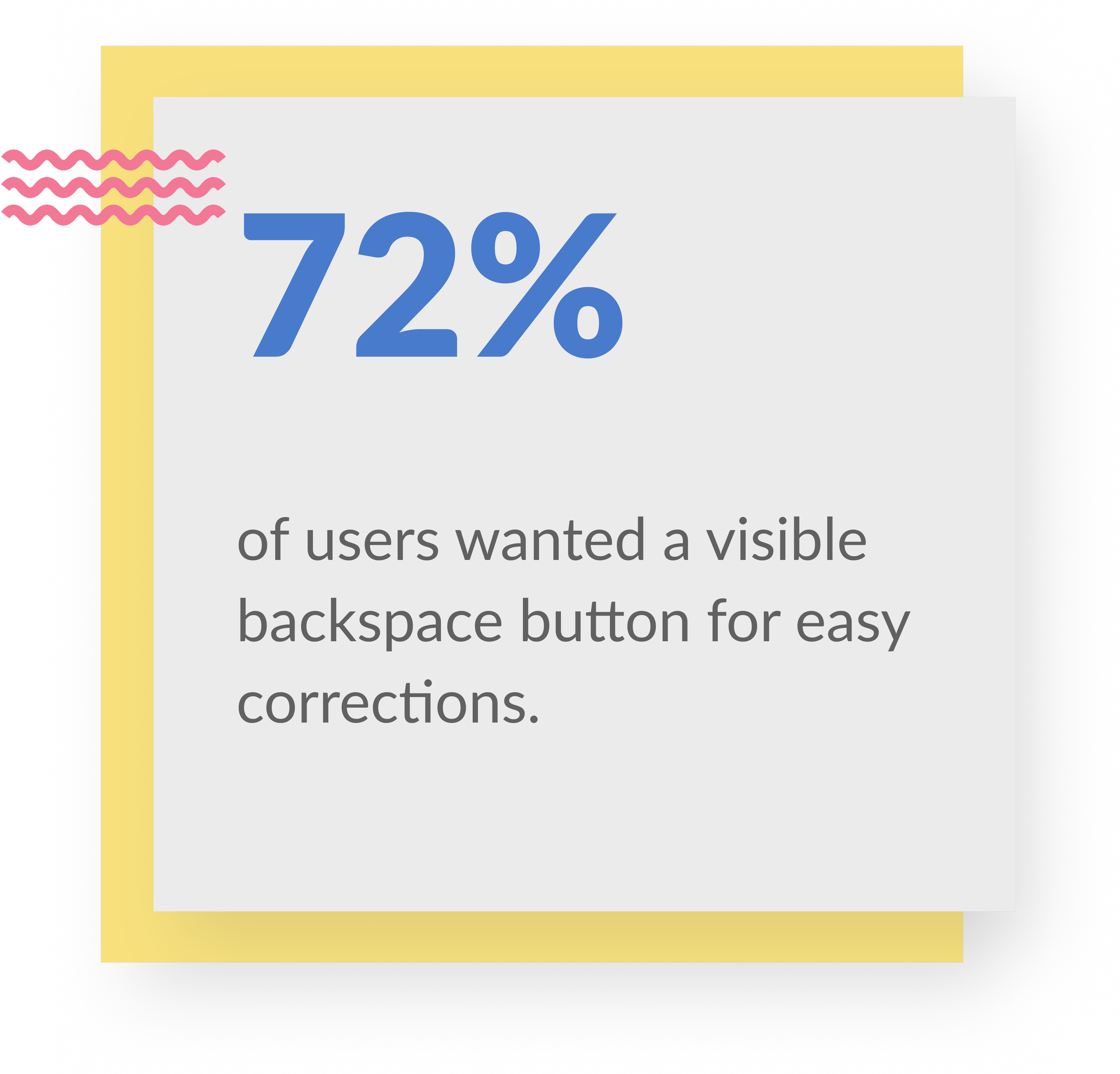
Visible Backspace Button
To address a major usability concern, I replaced the hidden swipe-to-delete gesture with a clearly labeled backspace button. This makes error correction more intuitive and accessible, reducing user frustration and streamlining the overall calculation experience.
Ongoing Calculations
The redesigned interface displays the full calculation in real-time, allowing users to track their inputs as they go. This improves clarity, reduces errors, and enhances user confidence—especially during complex or multi-step calculations.
Memory Functions
To improve efficiency for everyday use, I added memory functions (M+, M-, MR, MC) directly to the standard mode. This allows users to store, recall, and manage values without switching to scientific mode, making complex calculations quicker and more accessible.

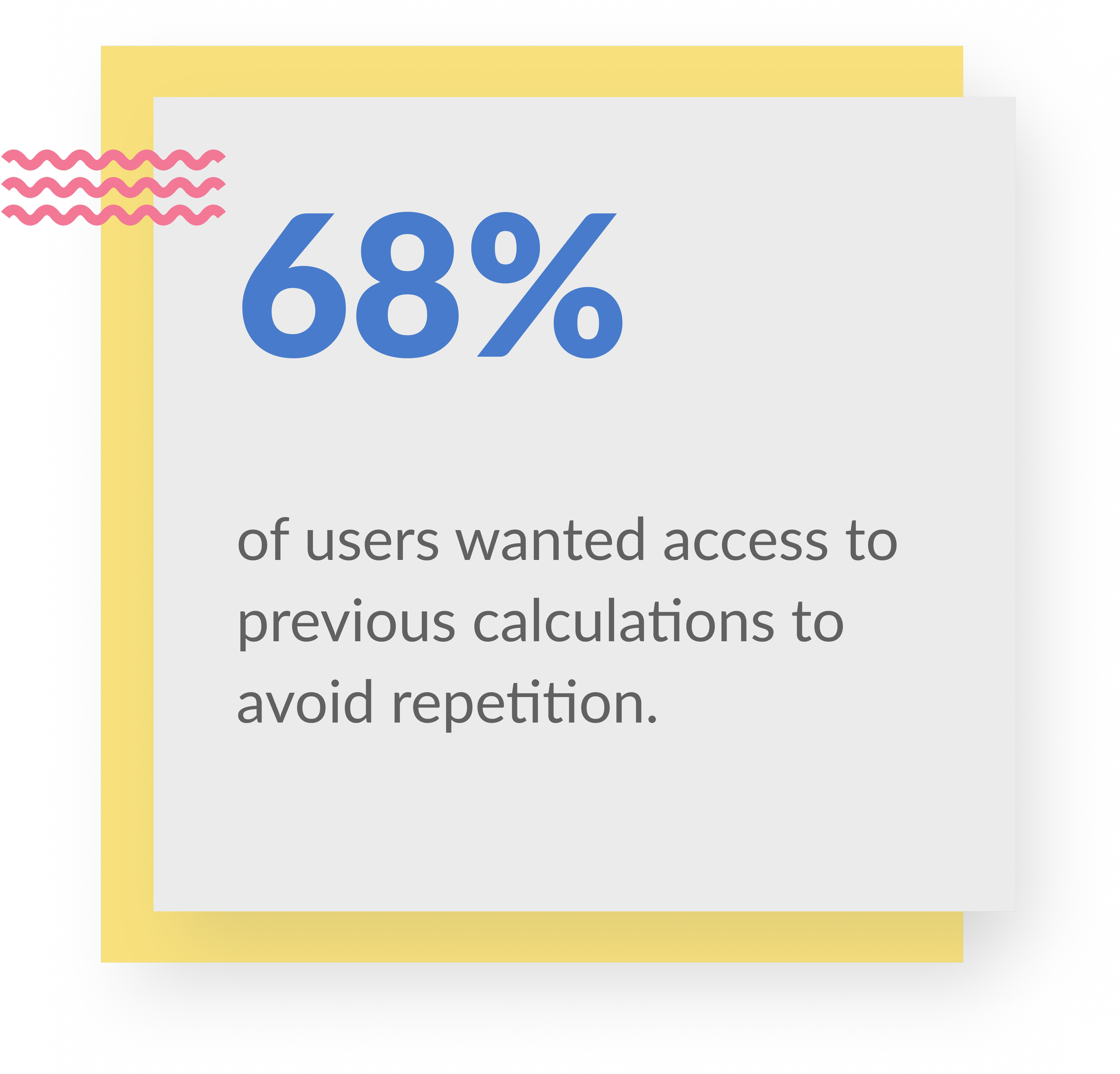
History Function
A dedicated history button lets users view and revisit past calculations, making it easier to track work, reference previous results, and avoid re-entering data—especially helpful for multi-step or repeated tasks.
Interface Appearance
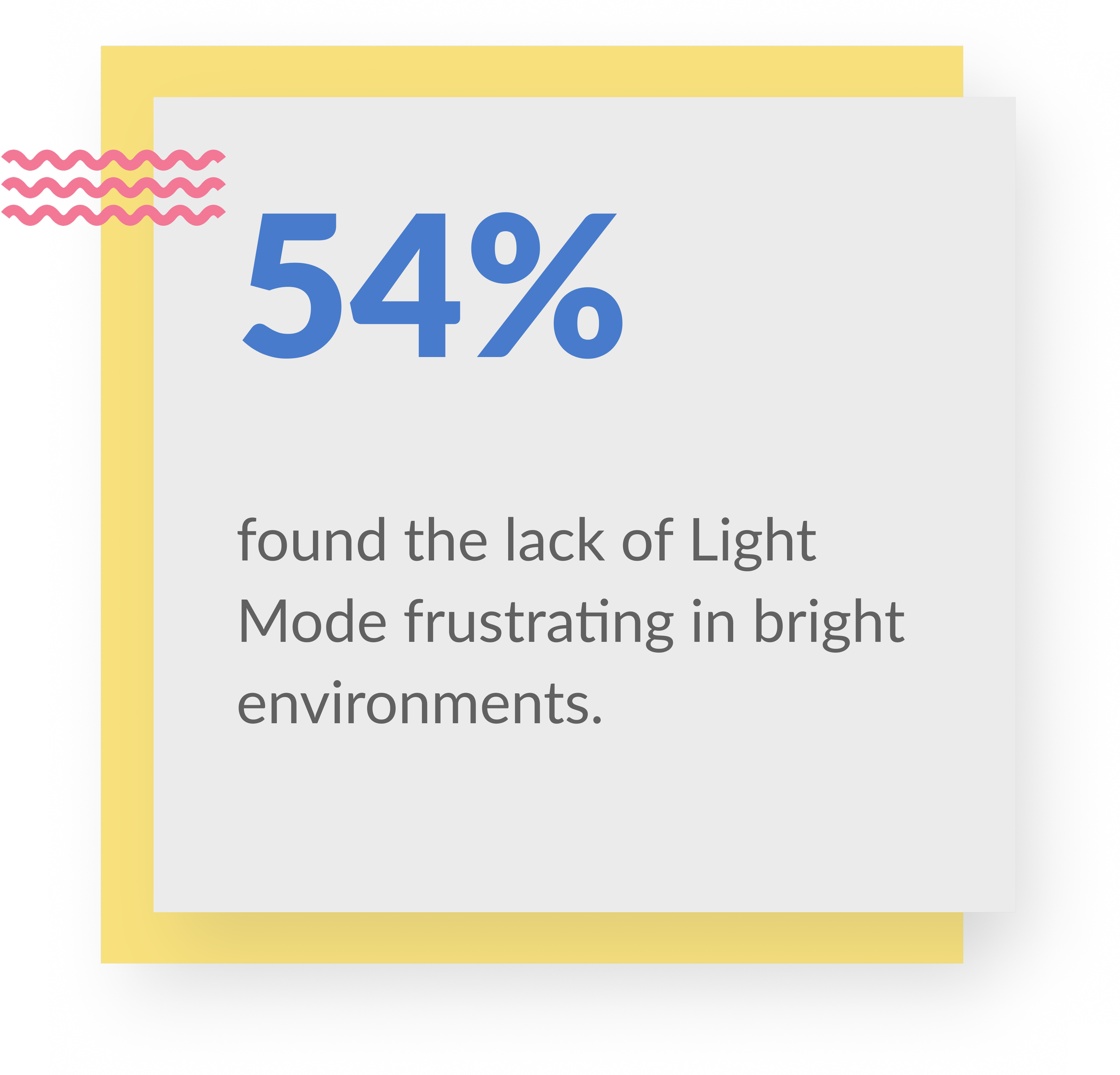
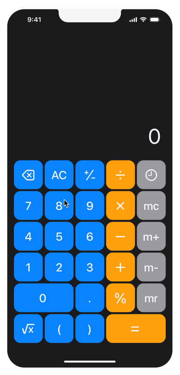
Unlike the original app, which was fixed in Dark Mode, the redesign introduces the ability to switch between Light and Dark Modes. This gives users greater control over their viewing experience, ensuring better visibility and comfort in different lighting conditions.
Research
Qualitative Interviews
I spoke with regular calculator users to understand their expectations, frustrations, and experiences with the Apple Calculator, aiming to identify usability gaps and missing features.

“I work with numbers daily, and not having a visible backspace is frustrating. One mistake, and I have to start over. A simple delete button would save time.”
-Dhruv Goel, Chartered Accountant

“The buttons are too small, and switching between modes is confusing at times. It would be much easier if memory and history were just built into the main screen.”
- Anand Malviya, Business Owner

“I use the calculator for daily tasks, but often forget what I just entered. A history feature would make keeping track without retyping everything much easier.”
- Meera Rajput, School Teacher
Insights


User Reviews
I also analyzed public reviews of the Apple Calculator app on the App Store to uncover recurring pain points, feature requests, and usability gaps directly from real users.
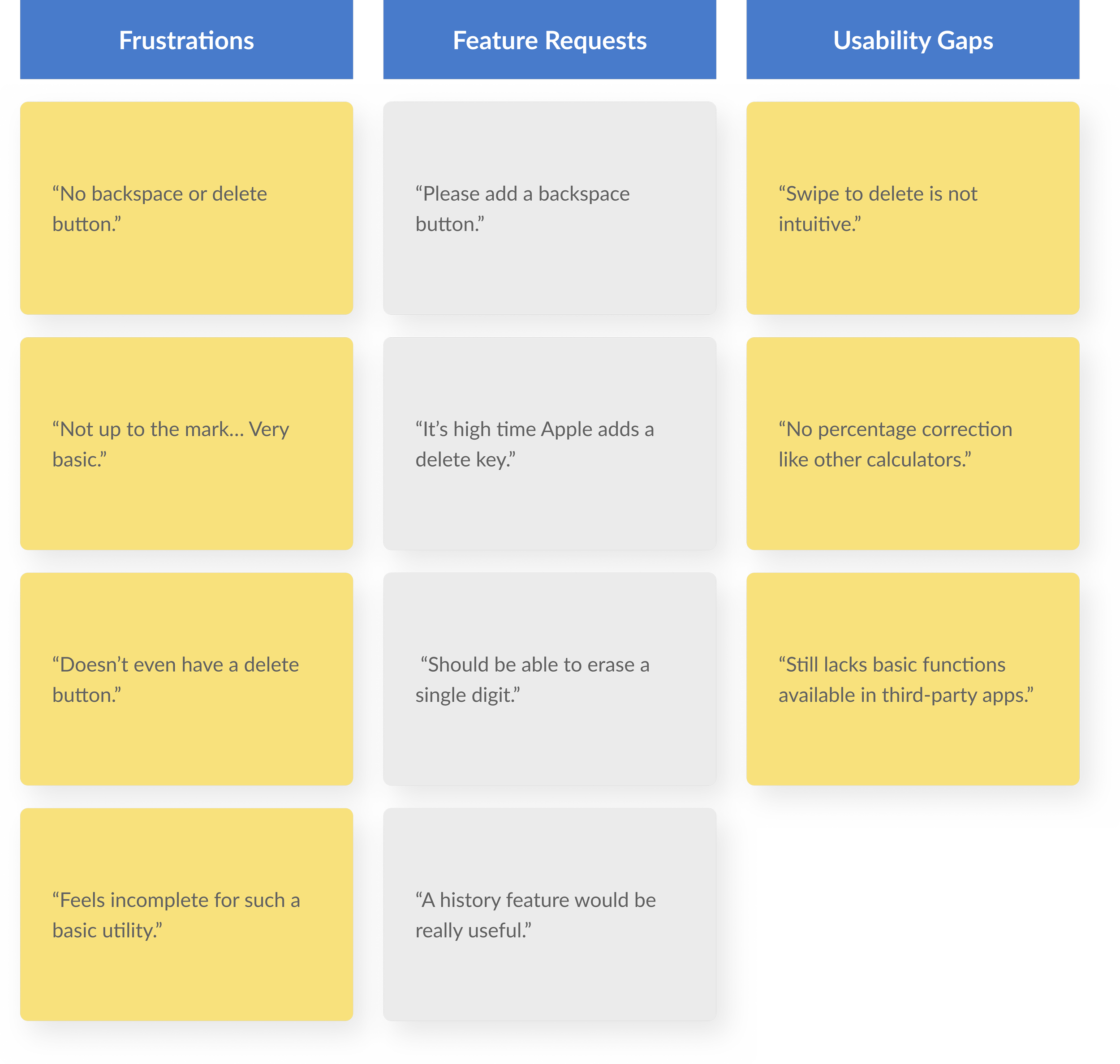
User Reviews of Competitor Apps
To understand what users value in third-party calculator apps, I analyzed reviews of top-rated alternatives on the App Store. This helped identify features and design choices that users prefer over Apple’s default calculator.

Prototyping
Initial Sketches
To start the redesign, I created low-fidelity sketches based on user feedback. These early concepts explored a visible backspace, memory functions in standard mode, and a more intuitive layout.
Colors Palette
This system supports both Light and Dark modes, ensuring clarity, contrast, and consistency across the Apple Calculator. It aligns with Apple’s Human Interface Guidelines, emphasizing simplicity and accessibility.

My initial sketch reimagined the Apple Calculator by replacing the “+/-” button with a backspace for easier corrections and resizing the “0” to add an ‘MR’ button. These changes improved usability and enabled complex calculations in standard mode.

In the second iteration, I added an extra row and column to expand functionality, including memory buttons, history, and advanced functions. While the “+/-” button was kept, the placement of “0” and “=” felt awkward, leading to further layout refinements.

In the third iteration, I resized key buttons to improve usability—enlarging “0” for easier access and removing the less-used “fx” button to streamline the layout. The design was closer to my vision, though some refinements were still needed.

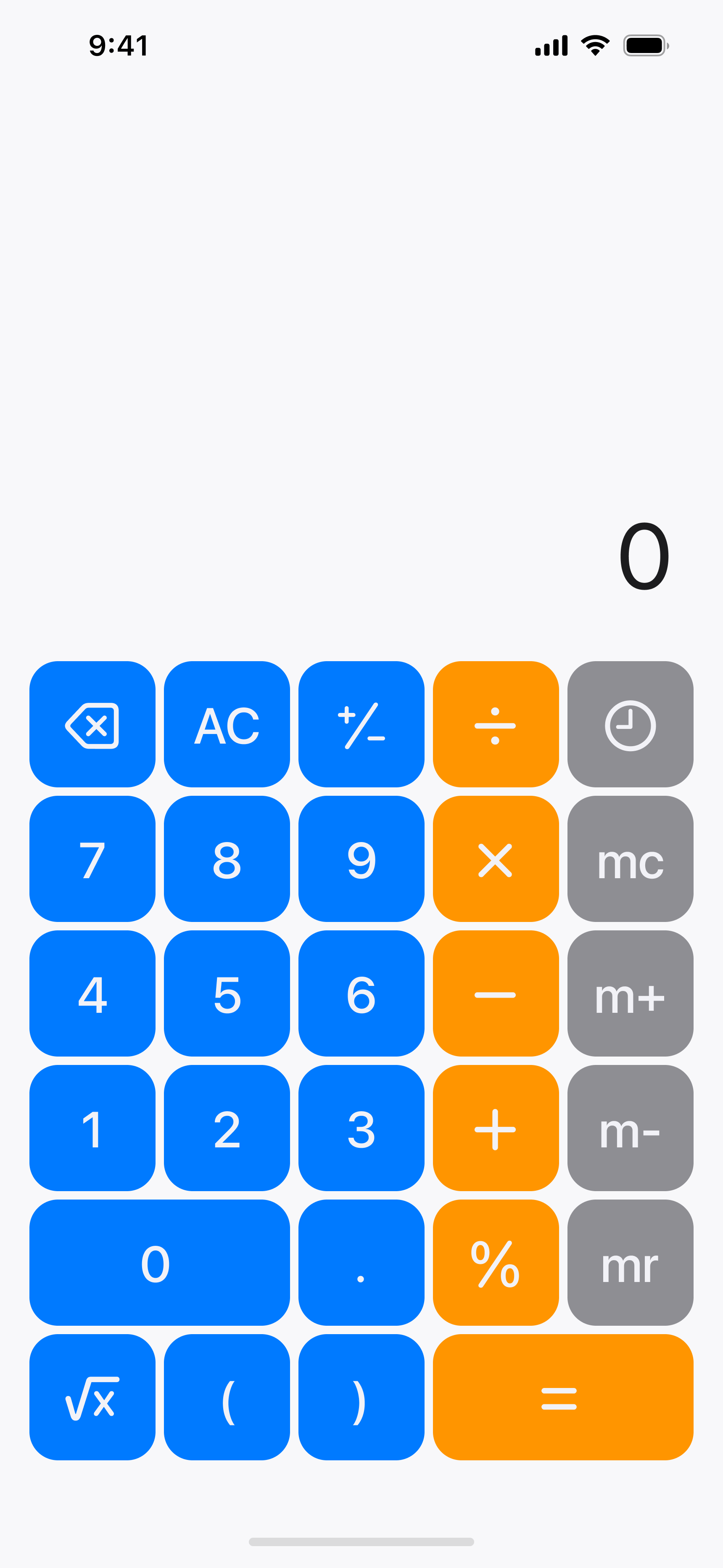
The final design aligns with user feedback, featuring an enlarged “=” button, a visible history button, and a consolidated parentheses key. It integrates all key requests—backspace, memory functions, and improved button sizing—for a more seamless and user-friendly experience.

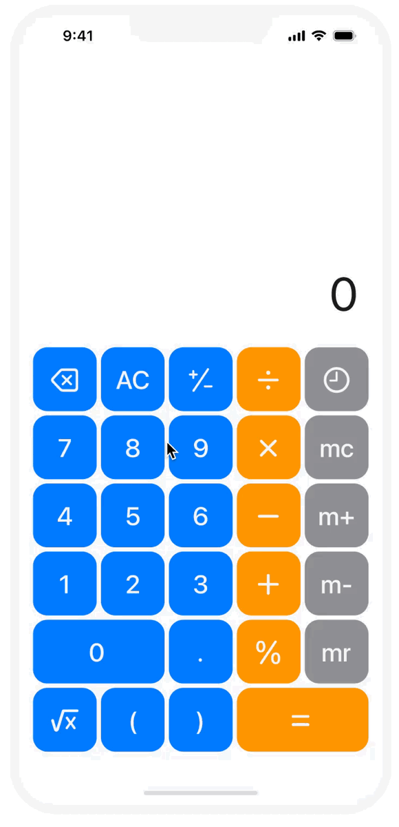
High Fidelity Mockups
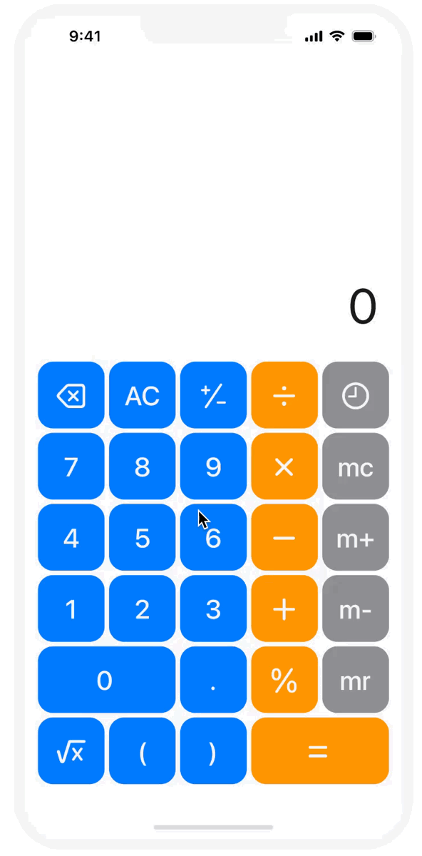
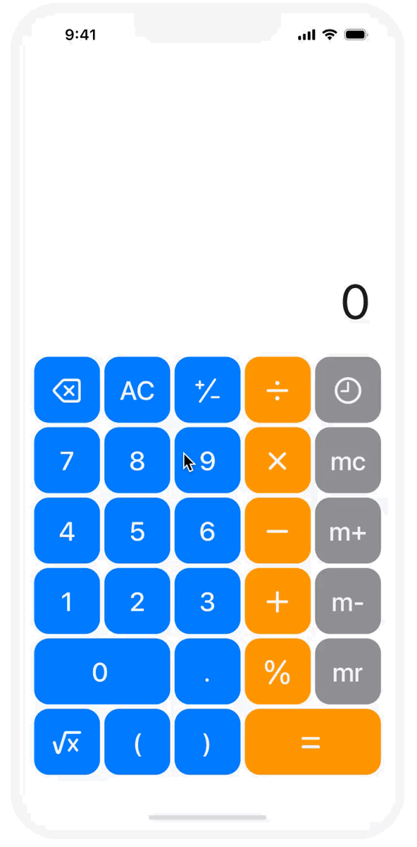
These final mockups display the redesigned Apple Calculator in Light and Dark Modes, featuring a visible backspace, memory functions, real-time calculations, and refined button sizing—enhancing usability while maintaining Apple’s clean design aesthetic.

Takeaways
Small changes make a big impact
Even minor adjustments—like adding a backspace button or displaying ongoing calculations—can significantly improve usability and reduce user frustration.
Listening reveals what’s missing
Analyzing user reviews helped uncover overlooked features users value most, like memory functions and history logs, guiding more thoughtful design decisions.
Functionality and familiarity can coexist
Enhancing functionality doesn’t mean sacrificing simplicity. The redesign kept Apple’s clean aesthetic while making the app smarter and more user-friendly.
Reflection
User Feedback Is a Design Superpower
Analyzing real reviews helped me prioritize changes that truly matter to users—like history tracking and error correction—leading to a more meaningful, user-centered redesign.
Simplicity Can Be Smart
Refining the interface reminded me that powerful features don’t need complexity. The best design is one that feels both familiar and intelligently enhanced.
Iterating with Purpose
Each sketch and prototype revealed new ways to balance clarity, functionality, and visual consistency—proving that thoughtful iteration drives confident design decisions.
Next Steps
Conduct Usability Testing
Test the redesigned calculator with real users to validate the improvements, identify pain points, and further refine interaction flows.
Explore Accessibility Features
Add features like dynamic text resizing, VoiceOver compatibility, haptic feedback, and high-contrast modes to improve usability for users with visual, motor, or cognitive impairments.
Design for Cross-Device Consistency
Adapt the design for iPads and Macs, ensuring consistent functionality and visual coherence across all Apple devices.